Paper Writing for PhD Students, pt 9: Methods

computer with editors open on-screen

Previously in this series on how to write a scientific paper: the lede – how to hook the reader

It doesn’t matter how beautiful your theory is. If it disagrees with experiment, it’s wrong. In that simple statement is the key to science.” -Richard Feynman

How to write the methods section? While much of this series has been about writing an exciting story, we now need to put excitement aside for a while. I’ve earlier claimed that scientific papers are not only containers of information. Their Methods sections, however, are. Their role is entirely utilitarian. So before we discuss form, let’s discuss function.

A Methods section of a scientific paper serves two purposes. First, it should let other researchers gauge whether your conclusions are justified and backed up by evidence—it should let other researchers assess how credible your data are, and how credible your analysis is. Second, it should allow other researchers to replicate your study and repeat whatever it is that you have done.

Unfortunately, as any experienced researcher knows, these goals are not always met. More often than not, the authors of a scientific paper do not explain the procedures that they have used in enough detail, even if there is a Supporting Information document with an unrestricted page count. It happens all too often that when the reader attempts to understand in detail how the authors have arrived at their results, she has to give up because that information is simply not there or it is too patchy.

Not being able to understand a paper’s methods or to replicate its pipeline leads to many problems. First, this contributes to the replicability crisis and therefore erodes the very foundation of science, the scientific principle itself: only those results that can be replicated by others can be taken as facts. Second, selling your discovery to the scientific community will be hard if your fellow scientists cannot trust your findings because they do not understand how they were obtained. Third, if your pipeline—from data collection to analysis—contains new methods or ideas, those will not be adopted by anyone unless they are clearly explained (or even wrapped up and served on a plate, say, as a software package). This leads to many lost citations and your work not being discovered. If you release data, someone can also use it for things that you didn’t think of, and if you release software, there will always be someone who needs it.

So please do take replicability and reuse seriously. Explain what you have done in as much detail as possible. Release your raw data. Release your intermediate results. Release your code. Reveal everything. Hide nothing. Be a good scientist. Don’t be an evil scientist.

If you release everything that there is to release, you will probably need to use external repositories. Some journals, however, do allow submitting supplementary data and code files, to be published together with the article. If you are thinking of hosting the data and code yourself, consider that we are talking about the scientific record here: your paper, your data, and your code should, in theory, be available forever. And forever is a mighty long time, as the late artist known as Prince once put it. It certainly is longer than the lifetime of the URL that points to your www homepage on your university’s server, or of the server daemon that runs on the Linux machine in your bedroom closet. So no DIY here, please—always use long-term data and code repositories, like Zenodo. While even those might not last forever, they’ll last longer than any self-hosted repository. Note that even GitHub is not futureproofed: it is run by a commercial company that can become extinct just like any other company.

Let’s return to the paper itself, and move from function to form. First, where to describe materials, data, and methods? This, of course, depends on the journal, and there are many options. The top-tier journal style (think PNAS, Nature, etc) is to have Materials and Methods as a separate section at the end of the article, as an appendix of sorts. In these journals, methods are only briefly described in the main text and the reader is referred to the Materials and Methods appendix for details. While writing a paper this way may at first feel difficult, this structure does make sense: the short letter format is all about the story, and technical details that would get in the way of the story are pushed aside. This may make writing feel harder because one cannot hide behind technical details: there has to be a story. However, beware of the dark side: referring the reader to the Materials and Methods section where only superficial details are given and where the reader is further referred to the Supplementary Information that adds detail but still lacks essential information, or where the limitations of the chosen methods are hidden in a subordinate clause on page 28. This structure makes it dangerously easy to sweep something under the rug. Which is why it often happens.

So if you are writing for one of these journals, do resist the dark side: do not hide problems in the SI. Other than that, just strive for clarity in the Materials and Methods. Typically this section comprises independent subsections for different items, so there is not much storytelling involved. In the main text, when talking about methods, describe their purpose, not their details: “we measure the similarity of X and Y with the help of (insert name of fancy similarity measure), see Materials and Methods for details.”

Then there is the style common to biomedical journals, where Methods are described in all their detail straight after the Introduction. This makes it easier to describe everything properly and more difficult to hide problems, which is good. The downside is that being hit by several pages of painstakingly detailed method descriptions is something of a turn-off: the story suffers. While this cannot be entirely avoided, it helps if you remember to provide context: begin each subsection by reminding the reader why this data set was collected, why this experiment was done, or why you are going to next describe some mathematical methods. Often, this is not more difficult than simply saying that, e.g., “to measure the similarity of X with Y, we need some well-behaved distance measure for probability distributions that…” and then describing the chosen measure.

The third way that is common, say, to the journals of the American Physical Society, is to happily mix methods with results, explaining how things were done and what the outcome was without making a distinction between the two. In this case, things like experimental setups or data collection procedures may still be explained separately, but typically all mathematical and statistical methods are described together with the results. In my view, this makes writing a smoothly flowing story easier than the biomedical style. It is easier to motivate the methods by saying that “next, we’ll investigate X, and to do that, we need to do Y, and look, here’s the result”. In the biomedical style, this connection is harder to make because the methods and results are separated, so one has to focus on making sure that the reader understands why the methods have been chosen and why the reader should understand their details.

Before concluding, let us return back to being good versus being evil, and talk about discussing the limitations of your methods. All methods have limitations, as every scientist knows, and it is best to lay these out in the open. In my view, the Methods section is the best place for doing this: while even minor limitations of methods are often discussed in the Discussion section, it feels more natural if they are addressed when the methods are introduced. Strangely, this even feels more honest. First, at least to me, it feels a bit like having been cheated if I have read a long paper, and only in the last paragraph, it is mentioned that by the way, we’re not sure that things work the way we just told they would. Second, it is easier for the writer to explain the limitations together with the methods. Third, it is also easier for the reader to understand the limitations and their implications if the details of the methods are fresh in her memory.

When addressing limitations, you should tread carefully: being honest is different from making it sound like your study is flawed. Joshua Schimel’s “Writing Science” introduces a great principle: say but, yes instead of yes, but. Instead of saying that your quite clear results would be much more detailed if your experimental setup would have a higher resolution (or similar), say that even though the resolution of your experimental setup is limited, your results are quite clear. The latter has a much more positive ring to it, although both sentences have the same information content. So don’t make it sound like there is something wrong with your work—if there is, fix it first, before writing your paper.

Coming up next in this series on how to write a scientific paper: how to write the results section.

Paper Writing for PhD Students, pt 8: The Lede – How To Hook The Reader

Previously on this show: how to write the introduction – a four-paragraph template

Keyboard

The first sentence of the first paragraph of any written piece of text is crucially important, as all writers of fiction know (“Call me Ishmael.”). Make it as strong as you can.

First impressions matter. The subset of potential readers who, after getting lured by the abstract of your scientific paper, have decided to have a closer look will first encounter the first sentence of the introduction. For them, this is another decision point: to read on or to stop. The second important sentence is the second one, and the third important sentence is the third one, and so on. The reader can choose to stop reading at any point, after each and every sentence. This means that the first sentence will be the most read sentence of your paper. Your second sentence will be read by fewer readers than the first, and your third sentence will be read by fewer readers still, and so on (if we assume that readers do in fact begin at the beginning instead of jumping in at random points). You will lose readers sentence by sentence whatever you do. This cannot be avoided.

The stronger the sentences, however, the lower the rate of attrition, and the higher the chance that some readers will make it through to the last one. Make the sentences flow and your readers will stick around. Glue them together with transitional words for clarity; place signposts to guide the reader. Create contrast and tension for excitement. Use cliffhanger endings: pose a question. Answer it in the next sentence.

Journalists use the term lede for the first few sentences of a news story—that is indeed how they spell it, instead of “lead”, presumedly for historical reasons that involve mechanical typesetting and lead (the metal, that is). The lede is the lead portion of a news story—it gives the gist of the story, it sets up the story and, most importantly, entices the reader to read the rest. While the lede should give a clear picture of what the story is about, it should not give the whole game away. The lede should raise questions so that the next paragraphs of the story can satisfy the curiosity of the reader by providing answers and details. Journalists even have their standard schemas for ledes. The inverted-pyramid lede attempts to compress the who-what-where-when-why-how of a story into a single sentence or two, and then adds details in decreasing order of importance. The question lede begins with, well, a question, one that you absolutely need to hear the answer to.

Let us have a look at some great openings and powerful first sentences.

As the first example, consider the first sentence of Battiston et al., “The price of complexity in financial networks”, PNAS 113, 10031(2016): “Several years after the beginning of the so-called Great Recession, regulators warn that we still do not have a satisfactory framework to deal with too-big-to-fail institutions and with systemic events of distress in the financial system”. This is a powerful beginning that immediately tells what the general problem addressed by the paper is. It also forces the reader to read on—after all, who wouldn’t want to know where this story is going?

Another example of a great opening, from Centola & Baronchelli, PNAS 112, 1989 (2015): “Social conventions are the foundation for social and economic life. However, it remains a central question in the social, behavioral, and cognitive sciences to understand how these patterns of collective behavior can emerge from seemingly arbitrary initial conditions.” The problem that drives the research is clearly spelled out in the second sentence. Note that in this paper, the exact research question will not appear before the 4th paragraph. The introduction forms a funnel from the broad problem to the more detailed question.

Finally, here is the first paragraph of Altarelli et al., Phys. Rev. Lett. 112, 118701 (2014): “Tracing epidemic outbreaks in order to pin down their origin is a paramount problem in epidemiology. Compared to the pioneering work of John Snow on 1854 London’s cholera hit [1], modern computational epidemiology can rely on accurate clinical data and on powerful computers to run large-scale simulations of stochastic compartment models. However, like most inverse epidemic problems, identifying the origin (or seed) of an epidemic outbreak remains a challenging problem even for simple stochastic epidemic models, such as the susceptible-infected (SI) model and the susceptible-infected-recovered (SIR) model.”

The above paragraph gets from the topic (tracing epidemic outbreaks) to the research question (identifying the origin of an epidemic) with three sentences, and the authors have even managed to include a brief historical detour of the you-know-nothing-John-Snow variety (sorry, I had to). This a great opening. The reader gets a clear idea of what the paper is about, and becomes curious: how did they solve the seed identification problem?

In the next post, we’ll move from the introduction to methods & results.

Paper Writing for PhD Students, pt 7: The Introduction – a 4-Paragraph Template

Introduction

The previous episode of the how-to-write-a-scientific-paper series can be found here; if you are new to the series and want to start from the beginning, click here. In this rather long one, we begin to move from theory to practice and talk about how to write the Introduction with the help of a four-paragraph template.

In terms of structure, the introduction of a scientific paper should follow an hourglass shape (broad-narrow-broad) but emphasize the context—the top of the hourglass—more than the resolution of the story.

A good introduction section begins with a paragraph that sets up the broad scientific context. This paragraph is important: it is the part of your paper that is most likely to be read, in addition to the abstract. In our now-familiar film script analogy, the role of the first paragraph is that of Setup. It introduces the world and the characters; it makes the reader familiar with the concepts and ideas that define the topic of the paper. The first paragraph also paves way for the coming paragraphs: it is the first step on the path to the sentence where the exact research problem of the paper is stated. To get the reader interested, a well-written first paragraph should already point out a broader gap in knowledge that the paper’s results aim at filling.

After the broad context has been introduced in the first paragraph, the scope of the introduction should narrow down. The next one to two paragraphs should move to the Confrontation phase: they should frame and motivate the problem tackled by the paper. They should also cite relevant literature to provide context and connect the paper to the streams of thought that together form your field of science. Then, the exact research question addressed by the paper should be explicitly and clearly stated. This sentence that reveals the question is the climax of the introduction, its highest point of excitement; it is also the narrowest point of the top-heavy hourglass.

What happens next varies slightly, depending on the format.

For short papers and the letter format, the introduction has to be wrapped up rather quickly; it is common to summarise the main finding and tell how it was obtained with one or two paragraphs before moving on to detailed results and methods.

For longer papers, it is common to provide a mini-review of the state of the art, an account of what others have done in the general vicinity of your exact research question. This can be followed by a condensed account of your approach to the problem—your experiments, methods, or theoretical points of view—followed by a discussion of your main findings. Note, however, that there are “old-school” traditions of scientific writing where the results are not discussed in the introduction at all: the approach is, but the outcome is not. Whether such a spoiler-free introduction is mandatory, expected, or grudgingly allowed depends both on your field and your journal. Finally, the introduction of a long paper often finishes with a map of the paper, an outline of what is to come: “In Section X, we will discuss…” and so on.

If you pick some of your favourite scientific papers and analyse their introductions, taking the time to understand the role of each paragraph, you will see that they almost always follow variations of the above arc. It is even possible to try to cluster papers by their type of variation—how many paragraphs are there before the key problem is stated? One, two, three? I’ve seen PNAS papers that move from the broad context to the exact research question in one long paragraph, but this is an exception rather than the norm. I would also rather split such long paragraphs. In any case, there is something of a formula, whose exact details depend on the format and length of the paper and the writer. The paper’s topic and its familiarity to the readers of the journal also play a role: research questions that are obvious to the intended audience do not require lengthy explanations, but new points of view or unexpected questions might.

So because there is a formula, let us use it as a template to write against, or as a starting point. Following a good formula makes writing easier. To this end, I will cover a paragraph-level template of the introduction section of a scientific paper that I often start with.

The aim of the template is to help you to develop a paragraph-level outline for your introduction. Developing an outline is essential before writing entire sentences—as I keep repeating, it is better to plan first and write afterwards. After all, how can you write if you do not know what to write? So, use the template to plan your introduction. For each paragraph, make a note of the topic and the point of the paragraph. You can list a few citations if you can already think of them. Also, do consider how to begin and end the paragraph. While we are not writing entire sentences yet, think about the points that the first and last sentences make—and by all means, if you wish to sketch these sentences, do so. The first and last sentences are the power positions of the paragraph. They have the biggest impact. Use them wisely.

This template is well suited for letters and short papers. It proceeds to the exact research question and the main conclusion of the paper rather quickly—the whole introduction is just four paragraphs long. It shouldn’t, however, be too difficult to expand the template for longer papers: just use more than one paragraph for each topic, and add an outline of the paper to the end if you wish. It is also perfectly possible to squeeze this structure into two paragraphs: just merge the first two and last two. The first two paragraphs provide context and lead to stating the research question; the third paragraph elaborates on the question and how it was approached, and the fourth paragraph states the main conclusion of the paper. The narrowest point of the hourglass is immediately after the second paragraph.

The first paragraph of the introduction is the opening and the so-called lede (it is really spelt that way; more on ledes in the next post); it defines the research question in broad terms and triggers the curiosity of the reader. It provides background—what is already known—and perhaps a glimpse of the knowledge gap, the unknown. In terms of plot structure, the first paragraph deals with the Setup and often the Confrontation as well: it introduces the world, the key characters, and an open problem, and makes the reader want to know what happens to them in the paper. At the same time, the first paragraph identifies your intended audience: readers who are interested in this particular world and its inhabitants.

The first sentence determines the topic of the paragraph and sets expectations on the contents of the whole paper. Avoid the easiest way of entry: it is tempting to use the (too) common opening where you first tell that your research topic has become important in the recent years because of this and that. I’ve done this far too often and I promise to avoid it in the future. There are more exciting ways to begin your story! Say something powerful. Move directly closer to where the gaps in knowledge are—do not begin with a long account of what is well-known already. You can fill in the details later.

After a strong beginning, you can continue the paragraph by giving a short overview of the state of the art, of what has been discovered already. This involves citing a number of earlier works; the aim, however, is not to provide an account of everything in the field—that’s what review papers are for. Rather, you should choose a handful of citations that provide context for the research problem that you address, and that at the same time connect your work to the broader progress of your field. Do cite your own work too, if relevant to the problem. This mini-review of what is already known can fill the rest of the first paragraph. You can describe past research in chronological or in topical order; often, what works best is a funnel structure, where you move closer and closer to your actual problem with every sentence.

The first paragraph is made stronger if there is a contrast, a sentence that says “Despite all this, we do not yet fully understand X…” or “However,  the role of Y remains an open question” or similar. This sentence can conclude the paragraph, or it can lead to one or more concluding sentence(s) that, say, discuss why it would be important to solve the problem or explain the problem in more detail. Note that the issue that provides contrast, the “not-understanding-X”, doesn’t have to be the exact research question that your paper deals with. It can be something bigger—the broader motivation for your question.

The last sentence of the first paragraph should lead to the second paragraph in a natural way. The above way of contrasting knowledge with the lack of knowledge provides an easy bridge. Your second paragraph can then begin by addressing whatever device you used for contrast—the knowledge gap, a lack of studies, or a lack of consensus on some matter. As an example, you can begin the second paragraph with a sentence that tells why X has remained an open problem. This is rather effective.

It is, however, also perfectly OK to structure the first paragraph simply so that each of its sentences just adds detail and depth to the point made by the first sentence. The first paragraph does not have to end with a cliffhanger. If your first paragraph follows this structure—framing the topic and then providing further details—the gap between the first and the second paragraph can be used to switch to a close-up point of view, to zoom in on your problem.

The second paragraph narrows the scope from the broad setup of the first paragraph and moves into the specific topic of the paper. In the second paragraph, the plot advances from Setup to Confrontation. Its aim is to get to the exact research question which is stated at the end of the paragraph. The second paragraph’s job is to point out the gap in knowledge that the paper aims at filling, through argumentation and illustration, and with the help of carefully chosen citations that point out the existence of the gap. These citations should emphasise what is not known over what is known—use the known to highlight the unknown. This gap in knowledge can be familiar to the scientists in your field—an open problem that most experts recognise—or it can be a hole in the knowledge that no-one has noticed yet. Except you.

The first sentence frames the topic of the paragraph, just like with the first paragraph; this is, by the way, true for all paragraphs, and we shall talk more about priming reader expectations later. This first sentence comes with the additional constraint that it has to seamlessly fit to whatever concluded the first paragraph, as discussed above. Here are some common devices that help to achieve this. If the first paragraph focuses on known things and does not pose a question, the second paragraph can begin with a contrasting statement or a question: “However, …” If the first paragraph concludes with a question, the second paragraph can directly continue from there: why is this question important, why hasn’t it been solved, or what approaches might be feasible for answering it. Again, it may be that this question is broader than the specific question that you have studied—in this case, use the second paragraph to move from the broad question to the specific question, motivating why answering it is important. If others have tried to tackle the question before you, the next sentences should tell how they have approached the problem, what they might have missed, and how your point of view relates to this existing body of knowledge.

Then, at the end of this paragraph, the research question addressed by the paper is explicitly and clearly stated.

At the beginning of the third paragraph of the introduction, the point of view moves from what others have done to what you have done. The third paragraph tells how you have approached the research question. In terms of the storyline, the third paragraph is about the action that takes place between Confrontation and Resolution. Now things finally start happening. The narrowest point of the hourglass has just been passed (it is exactly between paragraphs two and three).

The first sentence of the third paragraph tells what you have concretely done to answer the research question. It may begin with a more concise and focused formulation of the question. Examples: “To this end, we have carried out an experiment where…”, or “In this paper, we investigate the relationship between X and Y with the help of…” If you have formulated your research question as a hypothesis, state this hypothesis in the first sentence. A hypothesis is a strong beginning for the paragraph, so even if you haven’t formulated your problem as one, it might be useful to try to do it. While a lot of research is not about hypothesis testing, a clear hypothesis can be a powerful device for the narrative.

After reformulating the question, the rest of the third paragraph tells more about your approach. If you have designed and carried out an experiment to answer the research question that was made explicit in the second paragraph, tell about this experiment. If you have figured out a new theoretical approach to the problem, explain this approach. If you have collected and studied tons of data with new computational approaches, tell about the data and the methods. But stick to the point: we are writing a paragraph for the Introduction, not for Methods. There will be time to fill in the details later.

If needed—and if there is space—the third paragraph can be long; it can even be split into several paragraphs.

Finally, the fourth paragraph of the template moves from your approach to your findings. It (briefly) reveals the outcome of your work. As it is about the Resolution of the story, it is something of a spoiler—but everyone knows your ending already if they have read the abstract, so don’t worry.

I often keep the fourth paragraph short for maximum effect. It summarizes the key findings so that a busy reader can stop here, perhaps to return to the details later; yet it leaves enough unsaid to whet the reader’s appetite. Also, the brevity of the paragraph provides a nice contrast with the lengthy third paragraph; a short paragraph gives the impression of weight and importance.

I hope this introduction template is useful to you. Up next: a post on ledes and strong first sentences.
 

Paper Writing for PhD Students, Part 6: Introduction to the Introduction

writing

Recap: we are now at a stage where you have developed a storyline for your journal article, and this storyline has been condensed into the abstract of the paper. You have some figures and perhaps some schematics, categorized according to their role in the story (see the previous post). You have written draft versions of figure captions. Now it is time to start outlining the different sections of your paper. First, we will talk about how to write the introduction of a scientific paper.

Every story has a beginning and an end, and the Introduction is the beginning of the story that you are about to tell.

A good, well-written Introduction does several things: it introduces the reader to your problem and motivates the problem by reviewing relevant research. It introduces schemas and concepts used in the paper. It points out gaps in the existing knowledge that need to be filled for solving the problem. It defines the exact research problem that the paper addresses, and tells how your research has solved the problem or part of it. It shows how solving it contributes to the big picture. It identifies your reader—who should read the paper?—and makes her so curious that she cannot stop reading. It makes her excited about your work. It makes her want to know more.

In terms of our already-much-abused film script analogy, the Introduction takes care of both Setup and much or all of the Confrontation. This section already provides a glimpse of the Resolution of the story too. It introduces the world and the key characters of the story: the problem area and its important concepts. Remember: the reader will only want to read on if she cares about your world and its inhabitants and the problem that they are facing.

To entice the reader, the Introduction should emphasize the question, not the answer. It should not focus on what you have done, but on why you have done it and what follows from it. There should be an engine for the story, an important question, a need to know. This is what drives the story and whets the appetite of your reader. Curiosity is a strong emotion: trigger it with your introduction, and you have a reader.

Sidetrack: <nerdspeak>The Star Wars prequels failed because there was no big question! Everyone knew that Anakin Skywalker would become Darth Vader; how that would happen was mildly interesting at best. Boring! But at the time of writing this, I do not know what will become of Kylo Ren. And I want to know. </nerdspeak>

How to ask a strong question in the introduction? How to frame the gap in knowledge that needs to be filled? Of course, in a perfect world, your research has had a strong, clear question from the very beginning, and the knowledge gap is obvious. Then, just describe it. Perhaps you have chosen a research problem that everyone knows is important, say, how to solve X. You might even be the first one to have solved X—but this rarely happens because obvious problems are to researchers what a bowl of milk is to an alley full of cats. In any case, if your problem is well-known, you can be brief; if there have been earlier, not-so-successful attempts, or if there have been ideas floating around on how to tackle the problem, you can talk about these in the Introduction.

But, almost always, things are not this straightforward, and you need to think a bit harder about how to frame your question. It might even be that you are not entirely sure of what the question is. Perhaps you have started somewhere, but then along the way, you have noticed that the question you were asking was not the right one or the most important one. Then your research led you elsewhere, and now you are trying to figure out where. Perhaps the importance of your question is not obvious at all, except to you: then you need to tell the rest of the world why the question matters. Perhaps the question that you ask is something that no-one else has ever thought of—perhaps it is your question. If so, then this is a good thing: in my view, science is driven by questions instead of answers, and good questions are rarer than good answers.

When your research aims at answering a nontrivial question that requires a bit more motivating, a good strategy is to start the Introduction with something broad and more familiar, and then gradually move on to your new uncharted territory. All questions are related to bigger questions; begin with a big question and use it to frame the problem that you are solving.

In the next posts, I’ll talk a bit about the structure of the introduction (I’ll provide a template) as well as the importance of the first paragraph and, in particular, the first sentence.

Next: how to write the introduction of a scientific paper – a four-paragraph template

Paper Writing for PhD Students, Part 5: Figures

Figures open in an editor


[This post continues the PhD student paper-writing series from here]

At this point, we have covered establishing the focus of your scientific paper: you should already have a clear vision of what your paper is about, and the essence of this vision should be encapsulated in its abstract. You should also have the necessary ingredients at hand: the results to be presented in your paper together with ideas for schematic diagrams, organised into film-script categories according to their function and role in the story (Setup, Confrontation, Resolution, Epilogue).

The next step is to expand the storyline laid out by the abstract and to outline the different sections of your paper. This begins with choosing what sections make up your paper. Depending on your target journal, you may need to follow strict guidelines—the commonly used Introduction–Methods–Results–Discussion structure for instance—or to come up with a structure of your own. Even for short letter-format papers that may or may not have subheadings, it pays off to have a clear idea of what goes where. Usually, this is not a difficult task: all scientific papers begin with an introduction and end with a discussion, even if these span just a few paragraphs, and the results are sandwiched in between. Methods may be explained before the results, or after the discussion as an appendix of sorts (like in Nature and other glossy magazines).

What is more involved is choosing the order of presentation within the section structure. Here, a solid, tried-and-tested approach is to begin with the figures and their order of appearance. If you have followed the approach of this blog, your figures already come with handy labels (Setup, Confrontation, Resolution, Epilogue) and therefore you already have a good overall idea of their order. If your paper has to follow the standard structure, schematic diagrams and result figures will generally be placed in the Results section, so that figures of the Setup category come first and those of the Epilogue come last; schematic diagrams of the Setup category are an exception as they may belong to Methods or even Introduction. In any case, you’ve already done much of the work before you have even begun outlining the main text: the categories of the figures mostly determine their order. What remains to be done is to choose the order within each section in which the results and schematic diagrams are shown: what figure leads to the next?

The order of figures should tell a clear story so that each builds on the previous ones. You can use a multi-panel figure to tell a self-contained part of the story, a miniature story arc. You can combine, for example, a schematic diagram that explains your experiment (Setup), some basic statistics of your data (Setup), and a result plot or two that contains an unexpected finding (Confrontation). This mini-story multi-panel figure is a technique that I often employ in letter-format papers where the story has to move fast and get to the point quickly; it already brings the story close to its Resolution and the key result.

When you have chosen the figures, write a draft version of the caption for each figure. You may need to revise the captions later; at this stage, you may still be unsure of issues like notation and nomenclature, so don’t pay too much attention to details yet. However, try to write the figure captions so that they are self-consistent enough for a hasty reader to understand most of your paper just by glancing through the figures. After all, this is exactly what a great many readers do; this is what the editor of your journal does too, before deciding whether your paper is worth a closer look or deserves to be rejected outright. How long and how self-consistent the captions should be depends, again, on your journal; in some of the letter-format top-tier journals, captions tend to be very long, while in the lesser journals where we mere mortals publish, figures are discussed at length in the main text and therefore the captions can be shorter. In any case, please make sure that your caption tells what the reader should learn from looking at the figure. A caption that only tells that here we see Y plotted as a function of X is not enough; it is redundant if you have remembered to label your axes in the figure already. Always tell the reader what the message of the figure is.

Because much of the story will be told by your figures, let us talk about figure quality for a while. Figures are tremendously important; those who only skim through the paper won’t see much else. Figures make the first impression and first impressions matter. Clear, high-quality figures with a professional look tell that a lot of effort has been put into the paper, and the reader is more likely to trust its contents. Amateurish-looking figures with a colour scheme that looks like PowerPoint in the 1990’s leave the reader wondering if the results are of the same dubious quality.

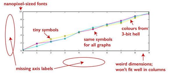
So do make sure that your figures look good. How to do this? First, learn the ropes of whatever program you use to generate your figures, whether it is a Python or R library, or a stand-alone piece of software (like Gnuplot that has been around since the dawn of man; it will probably outlast even cockroaches once mankind is no more). In particular, learn how to change fonts, how to increase or decrease font sizes, and how to use proper LaTeX-type fonts wherever appropriate. Learn how to choose and manipulate colours and colour schemes and symbols and shadings. Learn how to produce figures of chosen dimensions, so that you can later assemble them into multi-panel plots of your choice and combine them with schematic diagrams. Learn to match figure sizes to your target journal’s column width; not having to scale the figures takes some guesswork out of choosing font sizes (see below).

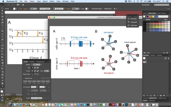
Second, do learn to use a vector graphics software to post-process your figures (and do learn the difference between bitmap images—they are made of pixels—and freely scalable vector images, made of lines and arcs and Bezier curves). At the time of writing, the industry standard (design industry, that is) would be Adobe Illustrator; there are many free alternatives such as Inkscape. With a vector graphics editor, it is easy to assemble multi-panel figures that contain schematic diagrams (drawn with the same editor) and result figures saved in vector formats (PDF, SVG). You can also add text, arrows, indicators, and so on, as well as retouch your result plots, changing line widths, colours of symbols, or their overall appearance. Often, this is much faster than trying to get everything right when producing the plots.

A few words on the layout: always align things—nothing spells “I am being careless” more clearly than subplots and schematics that are not neatly lined up (it takes just a few seconds to do this). Use white space properly: leave enough white space so that things can breathe, but don’t leave too much white space so that the figures don’t look barren.

Discussing data visualisation at length is beyond the scope of this blog post, but here are a few remarks. Pay attention to your colour schemes. For plot symbols, there are much nicer and much more informative schemes than the pure-RGB red, green, and blue symbols that some programs use as default; on top, your reader might be colour blind and have a hard time distinguishing between red and green. Always use different symbols AND colours for different curves for maximal clarity. If you want a personalised colour scheme, google for colour scheme generators (you have already learned how to set hexadecimal colour values in your program, right?). For heat maps and similar, pay attention to the neutrality of the colour map you use: make sure that it doesn’t artificially highlight some part of your range of values. In all cases, use colours consistently through your figures. If red and blue are categorical indicators of, say, two different data sets in a graph, do not use a heat map where red and blue indicate high and low values: reserve red and blue for the two data sets, and always use them this way. Likewise, if you use a colour map with a gradient from low to high values, reserve its colours for this purpose alone.

Then, labels and fonts. First, always label your axes. This is self-evident, but I still have to explicitly mention it; even though forgetting to label the axes of a plot should feel roughly like forgetting to get dressed when leaving for work in the morning, it still happens. So, I repeat: label your axes, period. At all stages of your work, even if the plot is just a draft for your eyes. And when labelling, please do make sure that the fonts you use are large enough when the figure is scaled to its intended size; if you have chosen the plot’s dimensions so that no scaling is required, use 10 or 12 pt. Not paying attention to font size is a very common beginner’s problem, and there are even many published paper where a magnifying glass is needed to understand what is going on in the figures. I suspect this has to do with the defaults of the commonly used software packages; default font sizes are almost always tiny. I’ve rarely (if ever) seen plots with annoyingly large fonts, so if in doubt, double your font size.

Common errors in results figures

Figure 1: Do avoid these common problems!

Finally, a few words about “having an eye for design”. While coming up with beautiful and impressive figures seems to come more easily for some, every student can learn to produce good-looking visuals. I’ve many times heard someone say “I cannot draw, and therefore my figures look ugly” but—as with any skill—it just takes time and patience; you do not need to go to art school to learn the essentials. Just like learning how to look at things is the key to learning to draw well, the key to producing great-looking figures is knowing how they should look like, instead of stumbling blindly. This is best learned by imitation. So, next time, take one of your plots that you are not entirely satisfied with, and look up a similar figure in some journal article that you like. Look at the two figures side by side, and try to spot the differences in composition, colours, fonts, line widths, and so on. Then modify your figure and keep on modifying it until you are satisfied with the outcome. Next time, you might not even need a reference figure.

PS This series of posts has been rewritten and edited and published as an ebook! Go get it from your favourite digital store!

Paper Writing for PhD Students, Part 4: Theatrical Cut, Or How To Konmari Your Paper

Laptop with a text editor open

This post continues the paper-writing self-help series for PhD students directly from where the previous post ended.

Once you have decided the key point of your paper and have settled on its main conclusion, the next step is to choose what results go in. This choice should be made with care: now that you have a point to make, plan your paper so that everything else supports this point. The rest should go! The best papers are often quite minimalistic: they drive their point home with essential ingredients only. Papers that contain tons of unrelated results are difficult to comprehend, because the reader is left wondering where to focus her attention. Clutter reduces clarity. Always konmari your paper! Keep what makes it happy and discard everything else.

Continuing with the film industry analogy, the process of going through your results and deciding what to keep resembles the process of editing of a Hollywood movie. After the movie has been shot, the director and the editor start working with an abundance of raw materials that are to be sculpted into the final product, the theatrical cut. The goal is to assemble the film from the shots and scenes that best support the storyline, cutting out footage that is not essential and that doesn’t have the emotional impact that the director desires.

Your paper is your theatrical cut. Use only the elements it needs, and leave out the rest.

Cutting out material and deciding not to use some of your results may feel difficult and painful – you spent a WEEK on that plot! But, believe me, it is for the best. If you want your work to have impact, it has to be read and understood, which is greatly hindered if there is too much unimportant or unrelated information to absorb. Clutter draws attention away from the point that you want to make, and leaves the reader exhausted.

Perhaps it is because of the pain caused by discarding perfectly-good-yet-unimportant results that most journals nowadays allow for an extended special five-hour-long director’s cut in the shape of a Supplementary Information document with an unrestricted page count. You can dump all those raw materials that didn’t make it to the theatrical release to the SI so that they can safely be forgotten and ignored by the rest of the world. But now your week spent making that plot means at least something.

But back to your cut – how to choose the results that are to be included and that support the key result?

Let us see how far we can push the film script analogy discussed earlier. A typical film script begins with the Setup phase where the characters and the setting are introduced, then moves on into the Confrontation phase where the characters are put in interesting trouble, and finally there is Resolution (epic fight in space followed by an exploding Death Star or similar). This may be followed by a brief Epilogue (with or without frolicking ewoks). If we divide our results into these four categories, Setup and Confrontation contain results that are needed for getting to the main result, for building up excitement and for leading the storyline to its climax. Resolution is the main conclusion that we discussed in the previous chapter. Epilogue shows what follows from the Resolution.

The Setup category contains plots and results that are required for the reader to make sense of the context, setting, your experiment, and/or your data (like, basic statistics, and so on). Schematic diagrams that visually explain the concepts that your paper works with also fall into this category; always include a schematic diagram or two!

The Confrontation phase brings the story closer to the final revelation that you aim to make; it highlights the open important question that you address. You can do this, for example, by showing empirical results that are surprising and cannot be explained by existing theories, and then providing an explanation as the Resolution of your storyline. You can also build up excitement by presenting a number of competing hypotheses or models, to be then shot down by your results (except for the one model that matches with your data and provides your Resolution). Or, you can begin by displaying some surprising system-level results or statistical observations and then home in on their detailed explanation in the Resolution phase.

The Resolution category should only contain your main result and key point; one to two figures.

The last category of results, the Epilogue, is more important than the last couple of minutes of a blockbuster film. These results are presented after the main result, and serve the purpose of highlighting its significance. One key technique is to think of some application or consequence of the main result and to illustrate this with, say, a figure that plays the role of an example rather than that of an important stand-alone result.

If you look at some research papers published in the glossy magazines (Nature, Science, and so forth), you’ll see that great many authors apply this technique: out of the four or so plots in those letter-format papers, the first is about Setup/Confrontation, the second is the key result (Resolution), and the rest are there for showing why the key result matters, or what it means (Epilogue). For the kinds of journals that us mere mortals publish in, these figure counts may be larger–the important thing is to decide on clear roles for your results and figures and use them accordingly when telling your story.

Next: how to use figures to tell your story.

Paper Writing for PhD Students, Part 3: The Importance of Focus

A keyboard

[This post continues my “self-help” series on how to write a scientific paper for PhD students; the previous episode can be found here. This series is an attempt to share some of the conceptual tools that I use with my students. Their point is to structure your thinking and focus your decision-making on a limited number of problems at a given time; having all options open at all times is an enemy of creativity.]

Scientific papers are stories, not just containers of information. The more focused and exciting the story, the more likely it is that it reaches someone. This is because that someone has to decide to invest their time in reading the paper, and as we all know, the world is full of papers, too many for any of us to read.

Thinking of papers as stories is something that doesn’t come naturally to most Ph.D. students or scientists. If we have been taught at all, we have been taught to write (boring) reports, certainly not to develop storylines, or to work with the kinds of higher-level conceptual elements that, say, journalists use.

Good writing starts with careful planning. I usually plan my storyline in three steps.

The first is defining the key point of the paper, the main conclusion that you want to tell the world. The second step is choosing the essential building blocks for the rest of the storyline, leaving out all results that are not necessary. The third step is taking these building blocks and arranging them into a condensed version of the storyline: the abstract of the paper. That’s right – I recommend writing the abstract before the rest of the paper. This is unconventional but it works.

Defining the focus of the paper – its key point and its main conclusion – is the most important step, as it lays the foundation for the rest.

In the best case, the key point is a single important result, but usually, things are slightly more complicated than that. In any case, you should be able to explain your point and main conclusion with one to three sentences. If you think that this is too little, consider these: the Earth rotates around the Sun, and not vice versa. Space-time is curved by mass. The salt of deoxyribose nucleic acid has a structure with two helical chains, suggesting a possible copying mechanism for genetic material. And so on. Clearly, a sharp focus doesn’t mean that the result is simplistic – to the contrary, there is usually a lot of depth behind results that can be described with a few words.

Choosing a key point that can be condensed into a few sentences doesn’t imply that your paper has to be narrow in scope. If your work is of an exploratory nature your key result might be that you have mapped out a problem area and your paper provides the map, or perhaps your main conclusion is a broad synthesis of several sub-results that make up the bulk of your paper. The most important thing is that you can make it clear to the reader what your paper is about.

If you can compress your message into a package that can be easily communicated, the higher the likelihood that it reaches its intended target, the reader. This is not limited to primary transmission – say, the reader encountering your abstract on the arXiv and deciding to read on – but secondary transmission is important too: getting the reader to share your paper with colleagues, online or face-to-face. Whatever the type of transmission, it works best if the thing being transmitted is compact and focused.

Communication is always difficult and all communication channels are noisy – a tight focus helps your message to make it through in one piece.

Next: Theatrical Cut, Or How To Konmari Your Paper

How to write a great abstract

[This post continues my “self-help” series on how to write a scientific paper for PhD students; the first post can be found here]

The first thing that you should do when starting a new research paper is to write the abstract. I also recommend spending a lot of time writing it. This will pay off later.

Writing the abstract first may seem unconventional, but it makes sense. This is because the abstract is the storyline of the paper in miniature form. It determines the rest. Once you have composed your abstract, you have decided on your story, and the rest of the paper is much easier to write.

So how do you write a good abstract? One common mistake is to view the abstract as an information container, whose only aim is to let the reader know what the author has done. An abstract written in this way reads like “we did X and the result was Y. Then we did Z and …” It becomes a boring list of results. Two important things are missing: context and excitement!

Think of a Hollywood movie. It begins with the setup phase, where the setting and the characters are introduced. You can only follow the story if you understand the setting and know the characters (context), and you will only care about the story if you care about the characters (excitement). The same applies to any research paper and its abstract: the reader must understand the context and care enough about the problem to read on and to find out how the problem was solved.

After the setup, a typical film script continues to the confrontation phase. There is trouble; there an issue that the characters have to solve. The resolution of the confrontation marks the high point of excitement in the story. After outworking the story, some brief epilogue may follow, providing closure.

Great papers and great abstracts follow a similar arc: from setup to confrontation and from resolution to closure. The storyline can be seen as hourglass-shaped: presenting the broad setting, introducing a more narrow problem and its solution, and returning to the broader picture again. It is not a coincidence that this is exactly how every Nature abstract reads.

How to write a great abstract: the hourglass shape

The script that every Nature abstract has to follow, sentence by sentence, begins with a few sentences on general context and the broader topic. Then, the abstract narrows down to more specific context (again a few sentences), before funnelling to its narrowest point: the exact research question addressed by the paper. This has to be followed by the solution of the problem: the key result. Then the abstract broadens again, first addressing the implications of the result to the paper’s field of science, and then discussing the impact beyond that particular field. Setup, confrontation, resolution, closure.

Even if you are not writing a Nature paper (and you probably aren’t), the above is still a great recipe for a successful abstract, and my suggestion is to always follow its spirit.

Of course, depending on your field and the chosen journal, the breadth of the top and the bottom of the hourglass may need to be adjusted. Instead of a context where your result contributes to solving mankind’s most pressing problems, your playing field may be just your particular field of science or its subfield. For a specialist journal, you don’t need to begin your abstract with a sentence on the importance of your field – the readers already know it. Nevertheless, it pays off to consider the broadest context you can honestly think of. Don’t exaggerate, but try to take a broader perspective. Why is your research question important –– why does it matter? The answer to this question is your context; it should directly translate to the first and last sentences of your abstract.

Next in the series: The Importance of Focus

Why can writing a paper be such a pain?

This is the first in a series of “self-help” posts for PhD students on how to write a scientific paper.

Writing a scientific paper

Show me a researcher who has never struggled with writing, and I’ll show you someone who hasn’t written anything, or who doesn’t care about the quality of the output. Science is hard, and so is writing. Together they are harder. Now add in lack of experience as a researcher and as a writer, together with the usual time pressure, and it’s no wonder that the blank document in front of you looks like the north face of Mount Everest. We’ve all been there, staring at that wall.

While no mountaineer would risk climbing Everest without a route plan, an inexperienced writer tends to neglect the importance of planning. Having no plan, she tries to do everything at once. She opens the blank document in her editor, stares at it, tries to decide what to make of her results, what the first sentence of the first paragraph should be, what the point of the first paragraph should be, and what the point of the whole paper should be.

It’s no wonder that this feels impossible. No-one can solve that many problems in parallel. Problems are best solved one at a time.

Writing becomes easier if one separates the process of thinking from the process of writing. To write clearly is to think clearly, and thinking precedes writing. Writing becomes a lot less of a struggle when you think through the right things in the right order, before putting down a single word.  A successful software project begins with the big picture: what functions and classes are needed, and for what purpose. It doesn’t begin with developing code for the internal bits of these functions and classes. A writing project should also begin with addressing the overall point and structure of the paper, before moving to details such as words or sentences.

Another way of looking at the problem is linearity versus modularity. The fear of the blank page arises out of linearity: the feeling that the only way to fill the page is to start with the first word and proceed towards the last, word by word. This is not so. Whereas reading is usually linear, writing doesn’t have to be. The process of writing should be modular – first, sculpt your raw materials into rough blocks that form your text, and then start working on the blocks, filling in more and more details, so that entire sentences only begin appearing towards the end of this process.

The approach I try to teach my students is splitting the writing process into a series of hierarchical tasks. This way, getting from a pile of results to a polished research paper is a bit less painful.

This approach begins by identifying the key point of the paper and then moving on to structuring the material that supports this point into a storyline. This storyline is then condensed into the abstract of the paper. My advice is to always write the abstract first, not last! This serves as an acid test: if you cannot do it, you haven’t developed your storyline enough.

After that, there are many steps to be taken before writing any more complete sentences: planning the order of presentation, including figures, and for each section of the paper, mapping the arc of the storyline into paragraphs so that the point addressed by each of the paragraphs is decided in advance. Then, the paragraph contents are expanded into rough sketches, and these sketches are finally transformed into whole sentences. At this point, there is no fear of the blank page, because there are no blank pages: for each section, for each paragraph, there is a map, a route plan, and the only decision that is needed is how to best transform that plan into series of words. Often, this feels almost effortless.

[Next in the series on how to write a scientific paper: how to write a great abstract]

There is now an ebook based on this series, available from a number of stores (Kindle Store, Apple Books, Kobo, Tolino, etc!)