The previous episode of the how-to-write-a-scientific-paper series can be found here; if you are new to the series and want to start from the beginning, click here. In this rather long one, we begin to move from theory to practice and talk about how to write the Introduction with the help of a four-paragraph template.
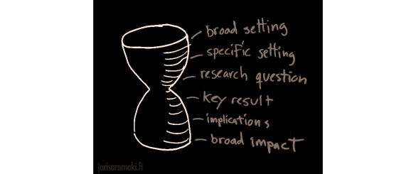
In terms of structure, the introduction of a scientific paper should follow an hourglass shape (broad-narrow-broad) but emphasize the context—the top of the hourglass—more than the resolution of the story.
A good introduction section begins with a paragraph that sets up the broad scientific context. This paragraph is important: it is the part of your paper that is most likely to be read, in addition to the abstract. In our now-familiar film script analogy, the role of the first paragraph is that of Setup. It introduces the world and the characters; it makes the reader familiar with the concepts and ideas that define the topic of the paper. The first paragraph also paves way for the coming paragraphs: it is the first step on the path to the sentence where the exact research problem of the paper is stated. To get the reader interested, a well-written first paragraph should already point out a broader gap in knowledge that the paper’s results aim at filling.
After the broad context has been introduced in the first paragraph, the scope of the introduction should narrow down. The next one to two paragraphs should move to the Confrontation phase: they should frame and motivate the problem tackled by the paper. They should also cite relevant literature to provide context and connect the paper to the streams of thought that together form your field of science. Then, the exact research question addressed by the paper should be explicitly and clearly stated. This sentence that reveals the question is the climax of the introduction, its highest point of excitement; it is also the narrowest point of the top-heavy hourglass.
What happens next varies slightly, depending on the format.
For short papers and the letter format, the introduction has to be wrapped up rather quickly; it is common to summarise the main finding and tell how it was obtained with one or two paragraphs before moving on to detailed results and methods.
For longer papers, it is common to provide a mini-review of the state of the art, an account of what others have done in the general vicinity of your exact research question. This can be followed by a condensed account of your approach to the problem—your experiments, methods, or theoretical points of view—followed by a discussion of your main findings. Note, however, that there are “old-school” traditions of scientific writing where the results are not discussed in the introduction at all: the approach is, but the outcome is not. Whether such a spoiler-free introduction is mandatory, expected, or grudgingly allowed depends both on your field and your journal. Finally, the introduction of a long paper often finishes with a map of the paper, an outline of what is to come: “In Section X, we will discuss…” and so on.
If you pick some of your favourite scientific papers and analyse their introductions, taking the time to understand the role of each paragraph, you will see that they almost always follow variations of the above arc. It is even possible to try to cluster papers by their type of variation—how many paragraphs are there before the key problem is stated? One, two, three? I’ve seen PNAS papers that move from the broad context to the exact research question in one long paragraph, but this is an exception rather than the norm. I would also rather split such long paragraphs. In any case, there is something of a formula, whose exact details depend on the format and length of the paper and the writer. The paper’s topic and its familiarity to the readers of the journal also play a role: research questions that are obvious to the intended audience do not require lengthy explanations, but new points of view or unexpected questions might.
So because there is a formula, let us use it as a template to write against, or as a starting point. Following a good formula makes writing easier. To this end, I will cover a paragraph-level template of the introduction section of a scientific paper that I often start with.
The aim of the template is to help you to develop a paragraph-level outline for your introduction. Developing an outline is essential before writing entire sentences—as I keep repeating, it is better to plan first and write afterwards. After all, how can you write if you do not know what to write? So, use the template to plan your introduction. For each paragraph, make a note of the topic and the point of the paragraph. You can list a few citations if you can already think of them. Also, do consider how to begin and end the paragraph. While we are not writing entire sentences yet, think about the points that the first and last sentences make—and by all means, if you wish to sketch these sentences, do so. The first and last sentences are the power positions of the paragraph. They have the biggest impact. Use them wisely.
This template is well suited for letters and short papers. It proceeds to the exact research question and the main conclusion of the paper rather quickly—the whole introduction is just four paragraphs long. It shouldn’t, however, be too difficult to expand the template for longer papers: just use more than one paragraph for each topic, and add an outline of the paper to the end if you wish. It is also perfectly possible to squeeze this structure into two paragraphs: just merge the first two and last two. The first two paragraphs provide context and lead to stating the research question; the third paragraph elaborates on the question and how it was approached, and the fourth paragraph states the main conclusion of the paper. The narrowest point of the hourglass is immediately after the second paragraph.
The first paragraph of the introduction is the opening and the so-called lede (it is really spelt that way; more on ledes in the next post); it defines the research question in broad terms and triggers the curiosity of the reader. It provides background—what is already known—and perhaps a glimpse of the knowledge gap, the unknown. In terms of plot structure, the first paragraph deals with the Setup and often the Confrontation as well: it introduces the world, the key characters, and an open problem, and makes the reader want to know what happens to them in the paper. At the same time, the first paragraph identifies your intended audience: readers who are interested in this particular world and its inhabitants.
The first sentence determines the topic of the paragraph and sets expectations on the contents of the whole paper. Avoid the easiest way of entry: it is tempting to use the (too) common opening where you first tell that your research topic has become important in the recent years because of this and that. I’ve done this far too often and I promise to avoid it in the future. There are more exciting ways to begin your story! Say something powerful. Move directly closer to where the gaps in knowledge are—do not begin with a long account of what is well-known already. You can fill in the details later.
After a strong beginning, you can continue the paragraph by giving a short overview of the state of the art, of what has been discovered already. This involves citing a number of earlier works; the aim, however, is not to provide an account of everything in the field—that’s what review papers are for. Rather, you should choose a handful of citations that provide context for the research problem that you address, and that at the same time connect your work to the broader progress of your field. Do cite your own work too, if relevant to the problem. This mini-review of what is already known can fill the rest of the first paragraph. You can describe past research in chronological or in topical order; often, what works best is a funnel structure, where you move closer and closer to your actual problem with every sentence.
The first paragraph is made stronger if there is a contrast, a sentence that says “Despite all this, we do not yet fully understand X…” or “However, the role of Y remains an open question” or similar. This sentence can conclude the paragraph, or it can lead to one or more concluding sentence(s) that, say, discuss why it would be important to solve the problem or explain the problem in more detail. Note that the issue that provides contrast, the “not-understanding-X”, doesn’t have to be the exact research question that your paper deals with. It can be something bigger—the broader motivation for your question.
The last sentence of the first paragraph should lead to the second paragraph in a natural way. The above way of contrasting knowledge with the lack of knowledge provides an easy bridge. Your second paragraph can then begin by addressing whatever device you used for contrast—the knowledge gap, a lack of studies, or a lack of consensus on some matter. As an example, you can begin the second paragraph with a sentence that tells why X has remained an open problem. This is rather effective.
It is, however, also perfectly OK to structure the first paragraph simply so that each of its sentences just adds detail and depth to the point made by the first sentence. The first paragraph does not have to end with a cliffhanger. If your first paragraph follows this structure—framing the topic and then providing further details—the gap between the first and the second paragraph can be used to switch to a close-up point of view, to zoom in on your problem.
The second paragraph narrows the scope from the broad setup of the first paragraph and moves into the specific topic of the paper. In the second paragraph, the plot advances from Setup to Confrontation. Its aim is to get to the exact research question which is stated at the end of the paragraph. The second paragraph’s job is to point out the gap in knowledge that the paper aims at filling, through argumentation and illustration, and with the help of carefully chosen citations that point out the existence of the gap. These citations should emphasise what is not known over what is known—use the known to highlight the unknown. This gap in knowledge can be familiar to the scientists in your field—an open problem that most experts recognise—or it can be a hole in the knowledge that no-one has noticed yet. Except you.
The first sentence frames the topic of the paragraph, just like with the first paragraph; this is, by the way, true for all paragraphs, and we shall talk more about priming reader expectations later. This first sentence comes with the additional constraint that it has to seamlessly fit to whatever concluded the first paragraph, as discussed above. Here are some common devices that help to achieve this. If the first paragraph focuses on known things and does not pose a question, the second paragraph can begin with a contrasting statement or a question: “However, …” If the first paragraph concludes with a question, the second paragraph can directly continue from there: why is this question important, why hasn’t it been solved, or what approaches might be feasible for answering it. Again, it may be that this question is broader than the specific question that you have studied—in this case, use the second paragraph to move from the broad question to the specific question, motivating why answering it is important. If others have tried to tackle the question before you, the next sentences should tell how they have approached the problem, what they might have missed, and how your point of view relates to this existing body of knowledge.
Then, at the end of this paragraph, the research question addressed by the paper is explicitly and clearly stated.
At the beginning of the third paragraph of the introduction, the point of view moves from what others have done to what you have done. The third paragraph tells how you have approached the research question. In terms of the storyline, the third paragraph is about the action that takes place between Confrontation and Resolution. Now things finally start happening. The narrowest point of the hourglass has just been passed (it is exactly between paragraphs two and three).
The first sentence of the third paragraph tells what you have concretely done to answer the research question. It may begin with a more concise and focused formulation of the question. Examples: “To this end, we have carried out an experiment where…”, or “In this paper, we investigate the relationship between X and Y with the help of…” If you have formulated your research question as a hypothesis, state this hypothesis in the first sentence. A hypothesis is a strong beginning for the paragraph, so even if you haven’t formulated your problem as one, it might be useful to try to do it. While a lot of research is not about hypothesis testing, a clear hypothesis can be a powerful device for the narrative.
After reformulating the question, the rest of the third paragraph tells more about your approach. If you have designed and carried out an experiment to answer the research question that was made explicit in the second paragraph, tell about this experiment. If you have figured out a new theoretical approach to the problem, explain this approach. If you have collected and studied tons of data with new computational approaches, tell about the data and the methods. But stick to the point: we are writing a paragraph for the Introduction, not for Methods. There will be time to fill in the details later.
If needed—and if there is space—the third paragraph can be long; it can even be split into several paragraphs.
Finally, the fourth paragraph of the template moves from your approach to your findings. It (briefly) reveals the outcome of your work. As it is about the Resolution of the story, it is something of a spoiler—but everyone knows your ending already if they have read the abstract, so don’t worry.
I often keep the fourth paragraph short for maximum effect. It summarizes the key findings so that a busy reader can stop here, perhaps to return to the details later; yet it leaves enough unsaid to whet the reader’s appetite. Also, the brevity of the paragraph provides a nice contrast with the lengthy third paragraph; a short paragraph gives the impression of weight and importance.
I hope this introduction template is useful to you. Up next: a post on ledes and strong first sentences.